The Art and Science of Visualization for Enhanced Situational Awareness
Author: TUBS 
Welcome to a comprehensive exploration of how visualization serves as a key catalyst in augmenting situational awareness. In this three-part series, we embark on a journey to unravel the symbiotic relationship between visualization and situational awareness, shedding light on how visual representation transforms complex data into actionable insights. From interactive dashboards to geospatial mapping, we will delve into how these techniques offer a visual narrative that empowers individuals and organizations to stay vigilant and proactive in dynamic environments.
Understanding Situational Awareness
Situational awareness goes beyond mere perception; it is a dynamic cognitive state that enables individuals to comprehend, interpret, and project information about their environment. Visualization becomes the bridge between raw data and human cognition, enhancing situational awareness by presenting information in a format that aligns with the natural processing capabilities of the human brain.
At its core, situational awareness involves the continuous gathering of information, the comprehension of that information, and the projection of its future state. Visualization acts as a force multiplier in this process, facilitating the rapid comprehension of complex scenarios, enabling quicker decision-making, and ultimately enhancing the ability to predict and respond effectively to changing situations.
The Power of Visual Representation and Benefits in Situational Awareness
The human brain is inherently wired for visual processing, making visualization a powerful tool for conveying information. This segment explores how visual representation enhances comprehension, allowing individuals to grasp intricate relationships, patterns, and anomalies that might be obscured in traditional text-based reports.
Visualization leverages the brain's natural affinity for images, providing a more intuitive and immediate understanding of information. Whether through charts, graphs, or interactive dashboards, visual representation transforms data into a visual narrative, enabling users to discern patterns, trends, and outliers with greater speed and accuracy.
An intuitive representation of information offers the following core benefits:
- Rapid Comprehension: Visualizations facilitate quick understanding, crucial in dynamic and time-sensitive situations. From real-time dashboards to interactive maps, the ability to absorb information at a glance is a hallmark of enhanced situational awareness.
- Pattern Recognition: Visual representations excel at aiding pattern recognition, allowing users to discern trends, anomalies, and correlations effortlessly. Whether it is identifying unusual activity in network traffic or recognizing trends in market data, visualization accelerates pattern recognition.
- Decision Support: Visualization provides a visual context for decision-making, offering decision-makers a comprehensive view of the situation. Interactive visualizations empower users to explore data, assess alternative scenarios, and make informed decisions in the face of uncertainty.
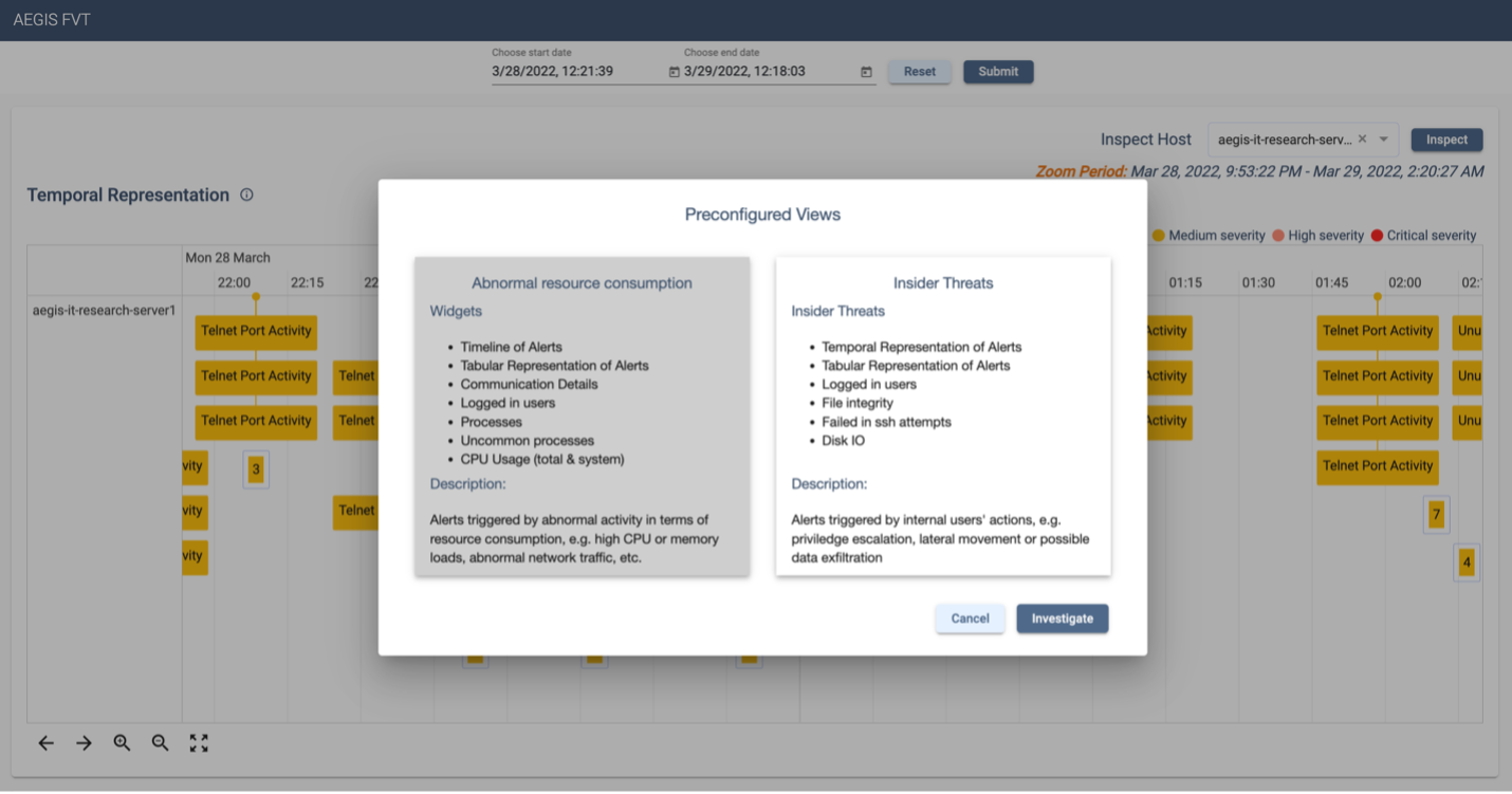
The benefits of visualization in situational awareness extend across various domains, from crisis management and emergency response to business operations and military strategy. An interactive and modular dashboard is a universal solution that can be configured to cover multiple areas.

Interactive Dashboards
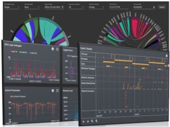
Dynamic dashboards serve as a central command center for situational awareness, consolidating diverse data into a unified, interactive view. We will explore how platforms like Tableau and Power BI enable the creation of dashboards that allow users to monitor real-time information, track incidents, and explore data in a user-centric manner.
Interactive dashboards provide decision-makers with the flexibility to customize their view, focusing on key metrics and data points relevant to their specific roles. Whether it is monitoring stock market trends, tracking social media sentiment during a crisis, or overseeing logistics in real-time, interactive dashboards offer a comprehensive and customizable visual interface.
Geospatial Mapping
Geospatial visualization takes center stage as we explore the world of mapping and spatial analytics. Mapping data onto geographical representations provides a spatial context, helping users identify trends, hotspots, and correlations that are location-dependent.
Geospatial mapping is particularly valuable in scenarios where location plays a critical role, such as disaster response, supply chain management, or monitoring the spread of infectious diseases. By visualizing data on a map, users can quickly understand the geographic distribution of events, resources, or incidents, enabling more effective decision-making based on spatial relationships.
Network Visualization
In the interconnected world, understanding relationships is paramount. Network visualization tools, such as Gephi, aid in unraveling complex relationships within datasets, providing insights into the structure of networks, connections, and dependencies.
Network visualization is instrumental in domains like cybersecurity, where understanding the relationships between entities can unveil potential threats. Whether visualizing the connections between devices in an IT infrastructure or understanding social networks, network visualization enhances situational awareness by revealing hidden patterns and potential points of vulnerability.

Temporal Analysis
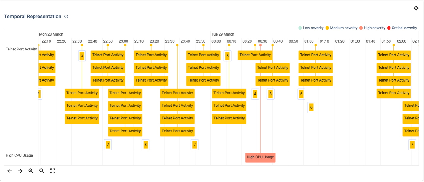
Situations evolve over time, and temporal analysis visualizations, including timelines and trend graphs, offer a historical perspective. We will explore how these visualizations assist in identifying patterns, predicting future trends, and understanding the dynamics of changing situations.
Timelines provide a chronological view of events, aiding in the understanding of the sequence of actions and the evolution of situations. Trend graphs, on the other hand, reveal changes in data over time, allowing users to identify trends, anomalies, and potential future developments.
Part 2 will transition from visualization techniques to real-world applications, showcasing how visualization enhances situational awareness in practical scenarios.
